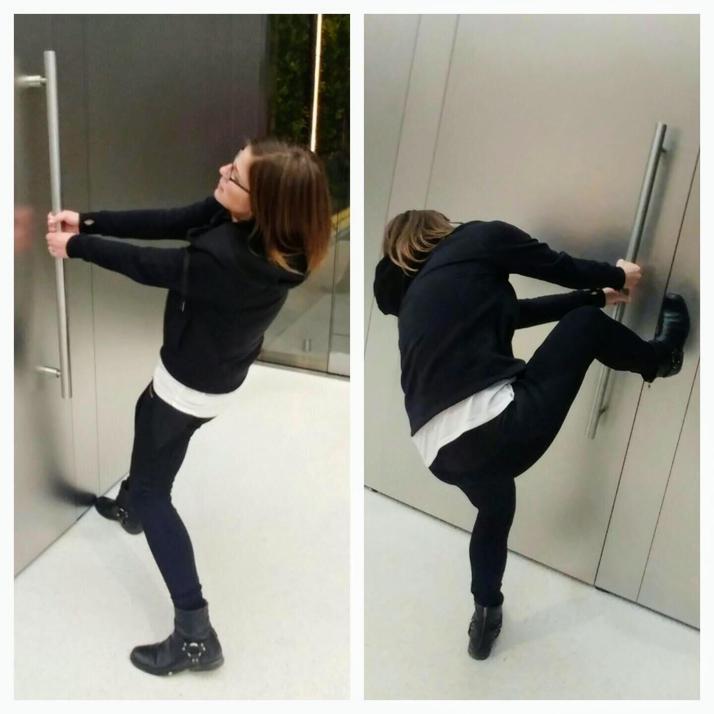
Introduction: The Mystery of Misbehaving Doors
In the realm of user experience and design, there’s a humorous yet insightful concept known as “Norman Doors,” named after cognitive psychologist and usability expert Donald Norman. These doors, ubiquitous in our daily lives, often baffle users with their ambiguous or misleading signals, turning simple tasks like entering or exiting a room into unintentional tests of intuition. This phenomenon underscores a broader issue in design: the misalignment between human expectations and the designed environment. This article delves into the concept of Norman Doors, exploring why they pose challenges for users, how they exemplify poor wayfinding design, and, crucially, how we can learn from these design failures to create more intuitive and user-friendly environments.

Understanding Norman Doors: A Cognitive Conundrum
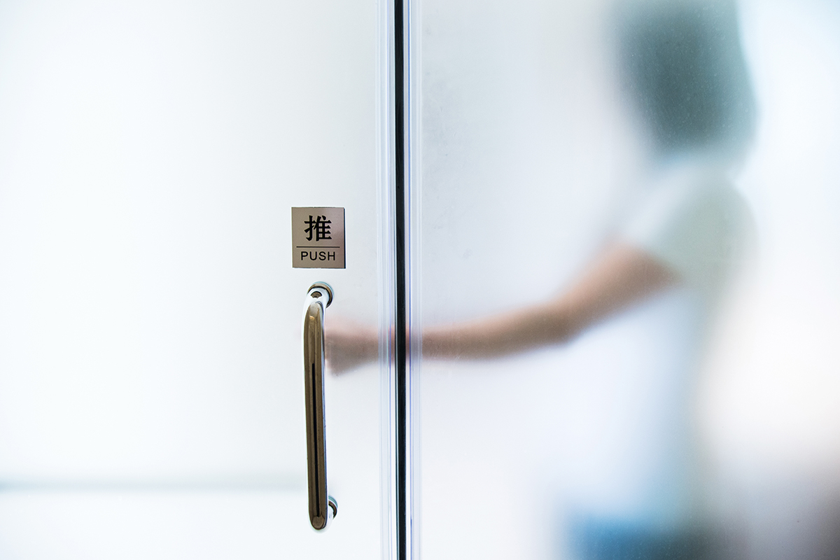
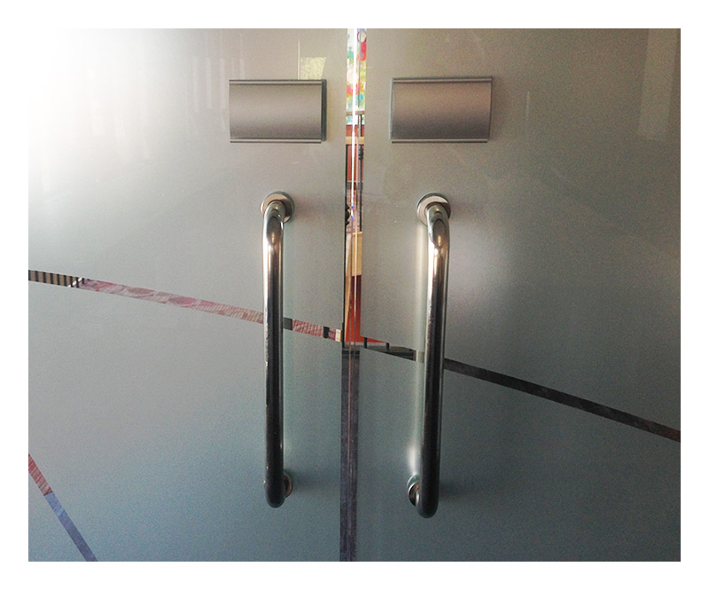
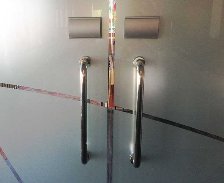
At the heart of the Norman Door problem lies a mismatch between affordances—visual cues that suggest how objects should be used—and the actual functionality of the door. For instance, a pull handle on a door that requires pushing to open sends conflicting messages to the user. This cognitive dissonance forces individuals to pause, rethink their actions, and sometimes even engage in trial and error, which can be frustrating and time-consuming. Norman Doors highlight a fundamental principle in design: effective communication between the designer’s intent and the user’s understanding is paramount. By examining these design flaws, we gain insight into the complexities of human perception and cognition, revealing just how delicate the balance is between form, function, and user expectation.
The Psychology Behind Doorway Dilemmas
To understand why Norman Doors are so prevalent, we must delve into the psychological principles guiding human interaction with our built environment. Our brains rely heavily on heuristics—mental shortcuts based on past experiences and learned patterns—to navigate through space efficiently. When faced with a door, we instinctively look for familiar signs like handles, push plates, or even the position of the hinges to determine how to operate it. However, when designers prioritize aesthetics over functionality or fail to consider these subconscious cues, they inadvertently create confusion. This highlights the importance of considering human factors in design, ensuring that our creations align with natural human behaviors and cognitive processes.
Designing for Intuition: Principles and Practices
To combat the Norman Door syndrome, designers must embrace a user-centered approach, prioritizing clarity and consistency above all else. Key principles include:
- Affordance Clarity: Design elements should clearly communicate their intended use. Handles should indicate pulling, while flat plates or bars suggest pushing. This can be achieved through shape, placement, or even color-coding.
- Visual Hierarchy: Prioritize visual cues that guide users naturally towards the correct action. For example, making push areas more visually prominent than pull handles on doors that swing inwards.
- Consistency: Establishing consistent design patterns across an environment ensures that once a user learns how to interact with one element, they can apply that knowledge to others seamlessly.
- Contextual Awareness: Understanding the specific context in which a door will be used (e.g., high-traffic areas, emergency exits) allows designers to tailor solutions that cater to those unique needs and user expectations.
- User Testing: Regular testing with real users can reveal potential points of confusion before they become problematic, allowing for iterative improvements that enhance usability.
Wayfinding Design: Beyond Doors
The lessons from Norman Doors extend beyond doorways into the broader realm of wayfinding design, which encompasses all aspects of navigating through built environments. Effective wayfinding systems should provide clear, continuous, and accessible information, guiding users effortlessly from point A to B. This includes signage, lighting, floor patterns, and architectural features that work in harmony to create a cohesive and intuitive navigation experience.
For example, airports often employ color-coded zones, digital signage with real-time updates, and clear directional indicators to assist travelers in navigating vast terminals. Similarly, hospitals utilize visual and textual cues to direct patients and visitors to different departments, emphasizing clarity and reducing stress during what can be an already overwhelming experience.
Case Studies: Successful Intuitive Designs
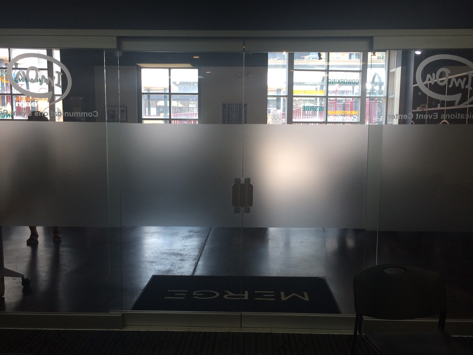
To illustrate the power of thoughtful design, consider case studies where redesign efforts have significantly improved user experiences. One such example is the transformation of confusing hospital corridors into intuitive pathways by introducing clear signage, color coding, and simplified layouts. Another is the redesign of public restroom entrances, replacing traditional swinging doors with sliding or automatic ones to eliminate the ambiguity associated with handling and to improve accessibility for all users.
Interactive Technology and Digital Interfaces
In the digital realm, the principles of intuitive design are equally crucial. User interfaces (UI) and user experiences (UX) must prioritize simplicity, consistency, and feedback mechanisms to ensure seamless interaction. Some key considerations include:
- Minimalism: Strive for simplicity in design by removing unnecessary elements and focusing on core functions. This reduces cognitive load and makes interfaces easier to navigate.
- Recognition Over Recall: Users should be able to recognize where to go or what to do based on familiar symbols and patterns rather than having to remember specific instructions. Icons that mirror real-world objects (like a trash bin for delete) are examples of this principle in action.
- Feedback and Confirmation: Provide instant feedback to actions taken by users. This can be as simple as a button changing color when clicked or a progress bar indicating task completion. It reassures users that their actions have been registered.
- Accessibility: Design for a wide range of abilities and preferences. This includes considerations for color contrast, font sizes, and support for assistive technologies to ensure everyone can use your interface effectively.
- Error Prevention and Recovery: Anticipate common mistakes and design to prevent them, or at least make recovery easy. Error messages should be clear, informative, and offer guidance on how to proceed.
Conclusion: Learning from Norman Doors for a More User-Centric World
Norman Doors serve as a poignant reminder that design is not merely about aesthetics; it’s fundamentally about understanding and facilitating human behavior. By recognizing and addressing the cognitive challenges posed by poorly designed doors, we can extrapolate these lessons to create more intuitive environments across all domains. As we move forward in an increasingly complex world, prioritizing user-centered design thinking becomes ever more critical. By doing so, we can transform everyday interactions from sources of frustration into seamless experiences, enhancing not just convenience but also the overall quality of life. In essence, every design choice is an opportunity to communicate effectively with users, fostering an intuitive world where navigating through spaces is as effortless as our innate desire to explore them.
